


SB22 is the first fully immersive betting and transactional platform. In the industry dominated by legacy solutions and technical debth we were tasked to chalenge status quo. Our job was to reimagine environment from the scratch bringing entire gambling and gaming industry up to the date with modern technologies, user experiences and design solutions. Over a three-year period, the platform was designed and built from the ground up as a mobile-first, white-label product, supporting a wide range of devices including iOS and Android apps, desktop, Apple Watch, Apple TV and kiosk environments. My role focused on shaping the end-to-end user experience and interface systems across all platforms, ensuring consistency, scalability, and adaptability while meeting the performance and regulatory demands of a modern sports betting ecosystem.




This was the largest and most challenging project of my career. Over the course of three years, I worked as the main UX/UI designer on a fast-paced startup building a next-generation, mobile-first sports betting platform from the ground up. We weren't improving an existing product or working around legacy systems, we were defining the experience from the very first screen while the platform itself was still taking shape. The pace was relentless, with the first public demo expected just three months after the project began.
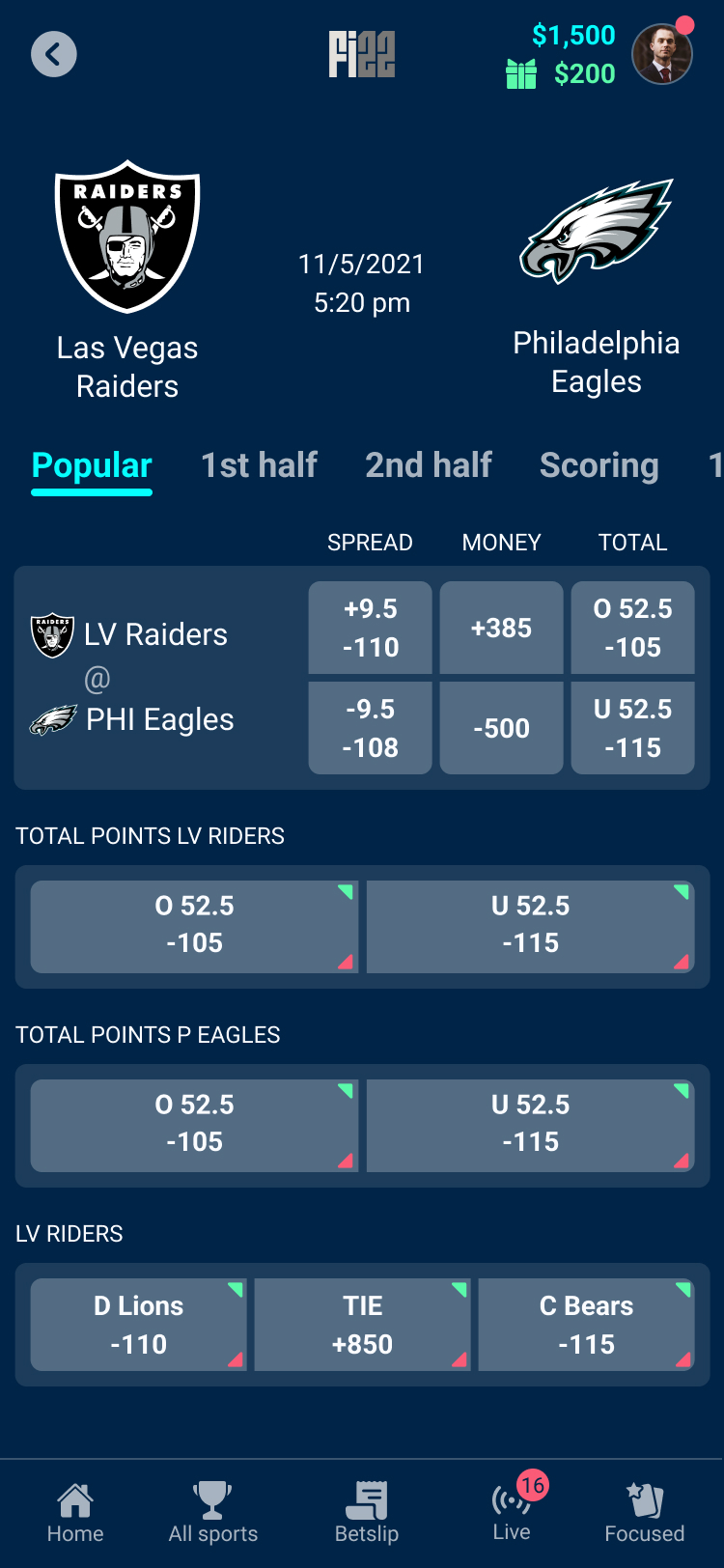
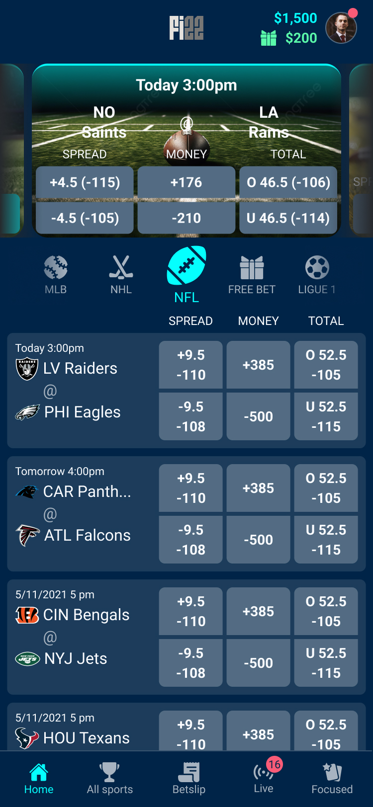
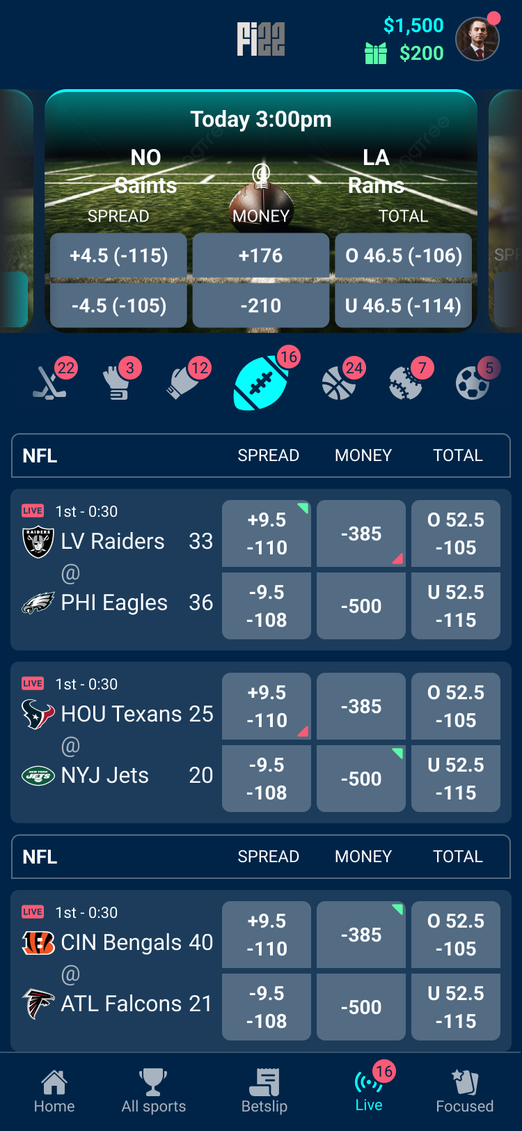
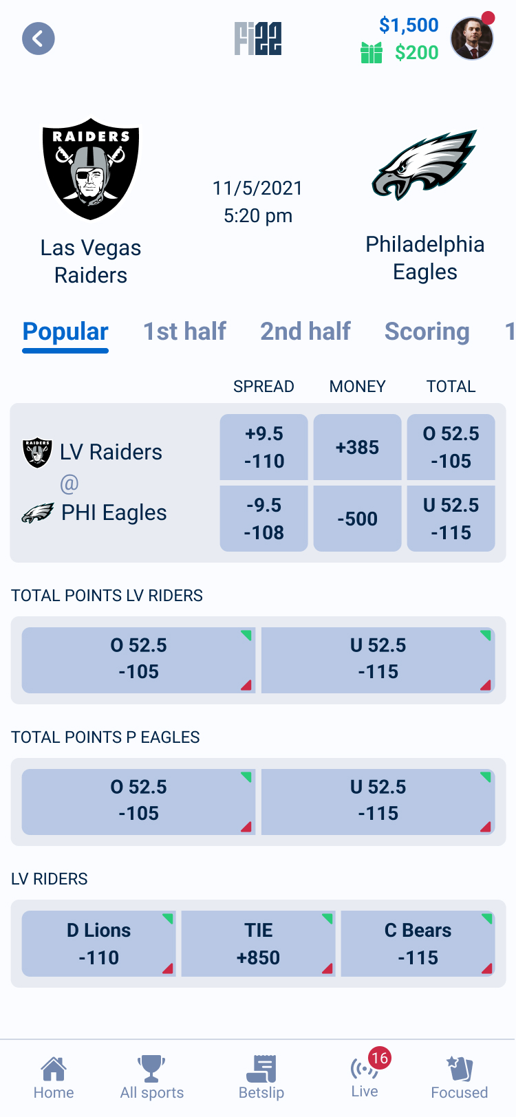
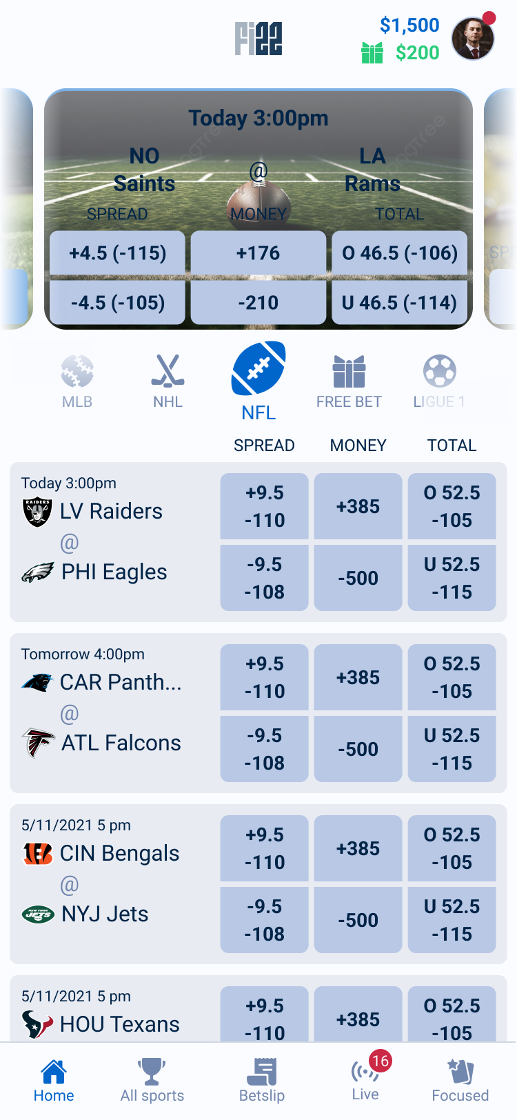
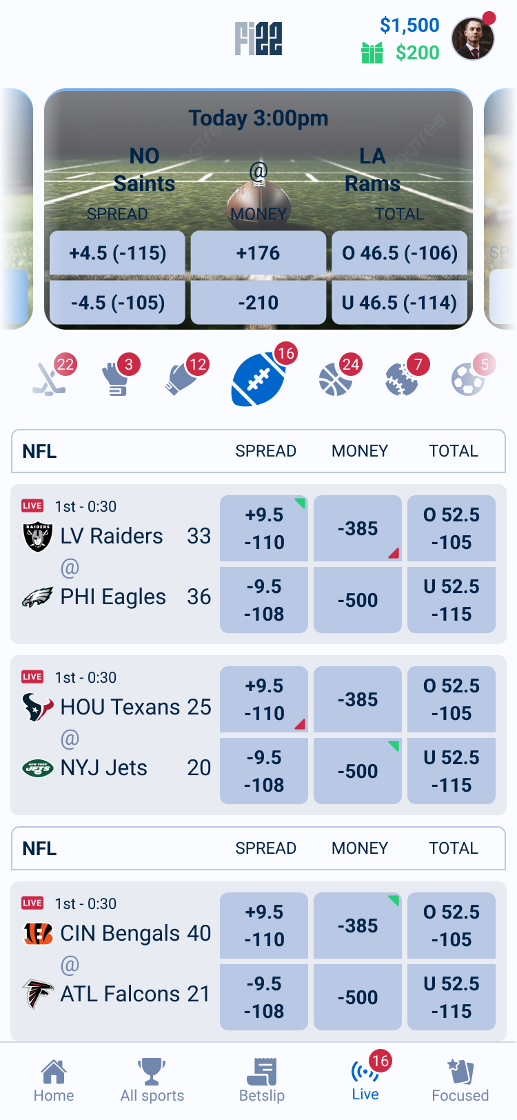
Those first months required making decisions that balanced speed with long-term thinking. While the immediate goal was delivering a polished mobile experience, I was also designing a foundation that could support future products and workflows. Every navigation pattern, component, and interaction needed to be reusable because we already knew the platform would eventually expand beyond the customer-facing application into operator back-office tools and additional touchpoints across the product ecosystem.
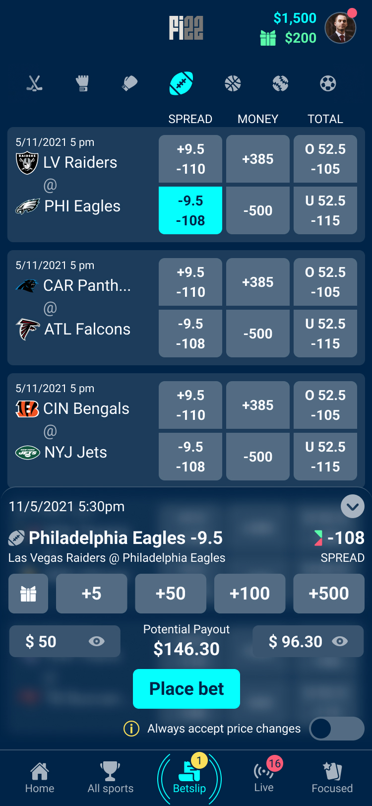
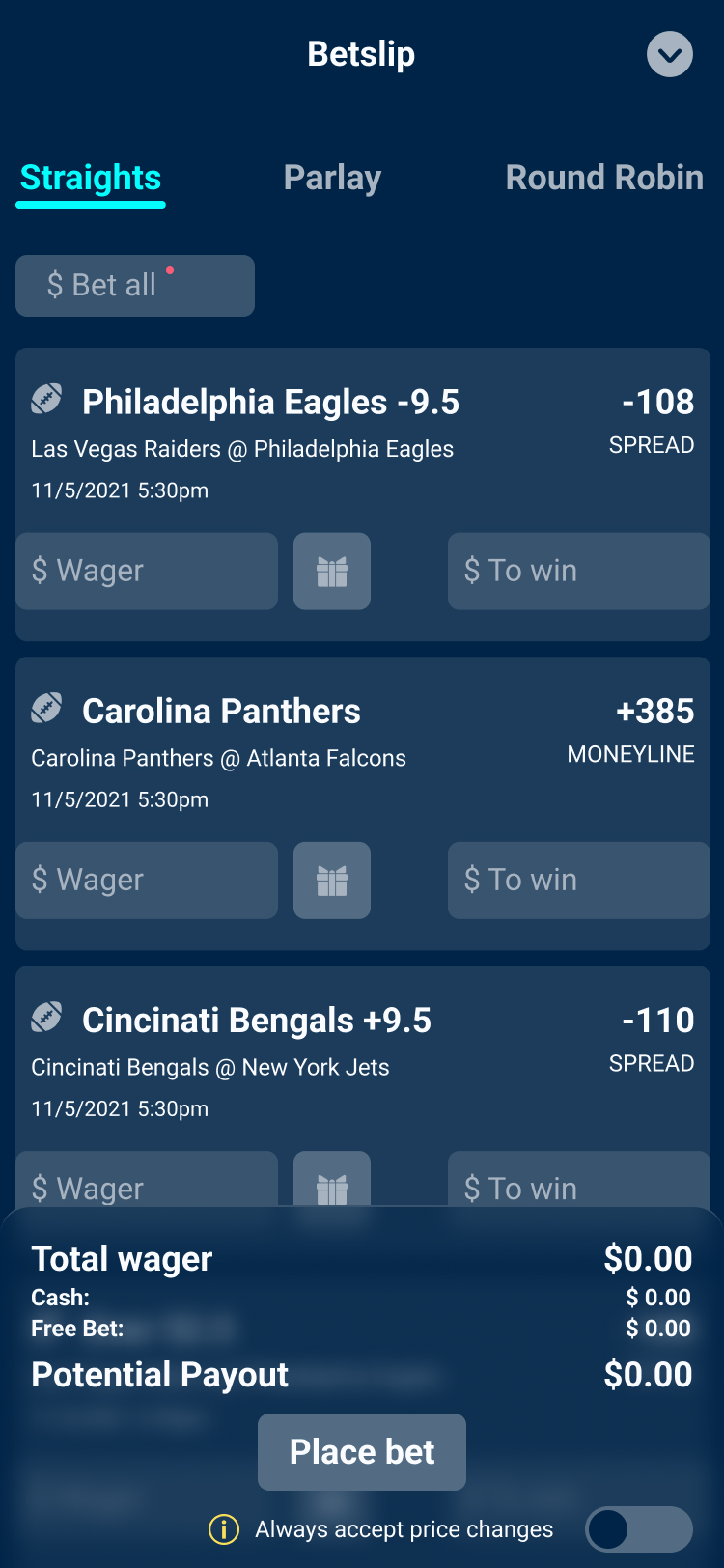
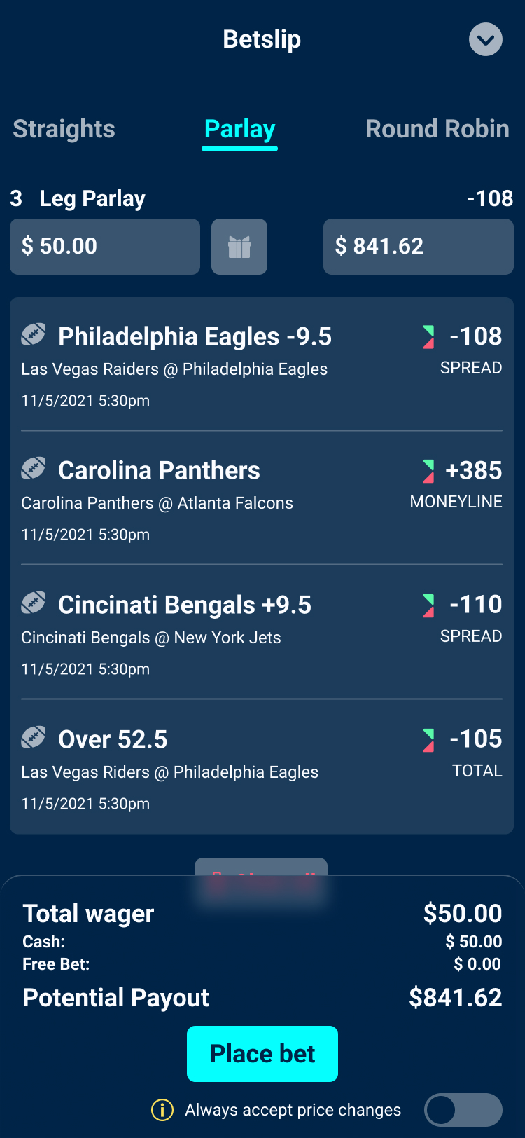
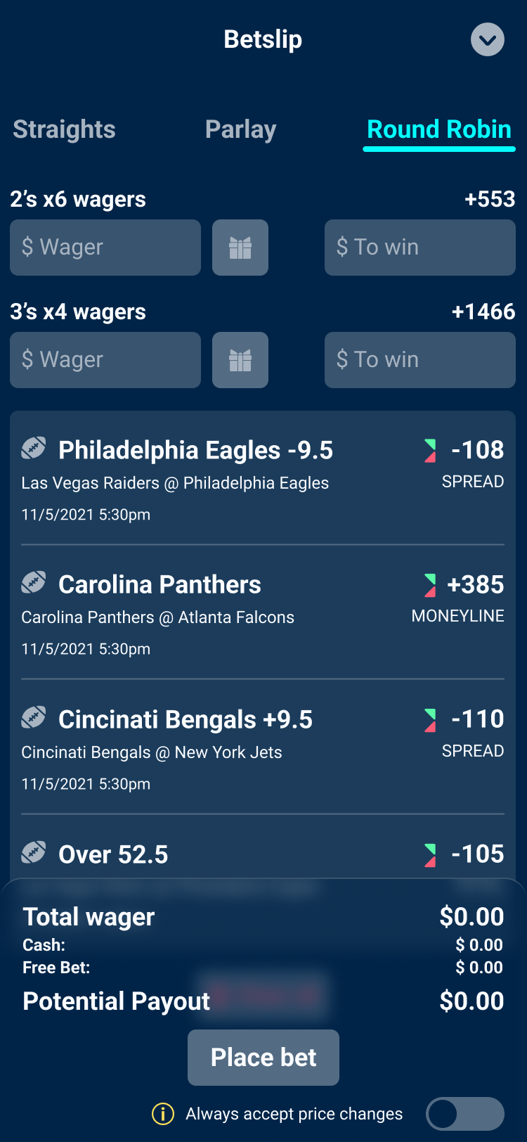
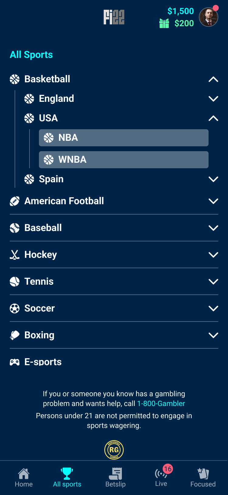
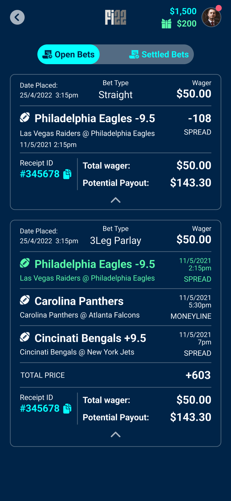
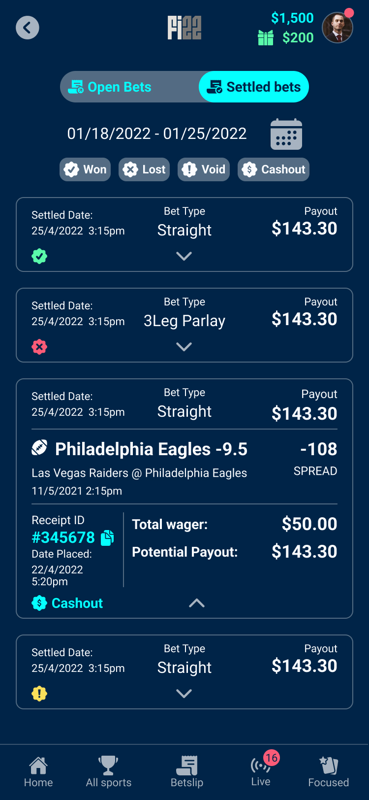
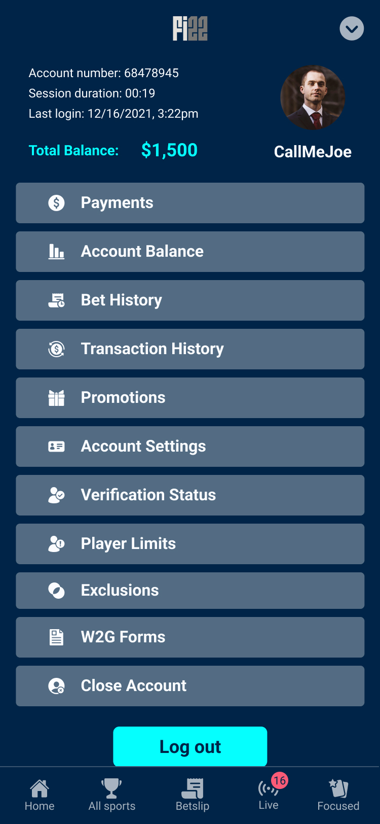
As the platform evolved, my role extended far beyond designing individual screens. I worked closely with developers to establish a scalable design system, define user flows, and structure an interface capable of accommodating an ever-growing number of sports, betting markets, promotions, and account features without becoming overwhelming. We were continuously designing a system that could evolve alongside the business.
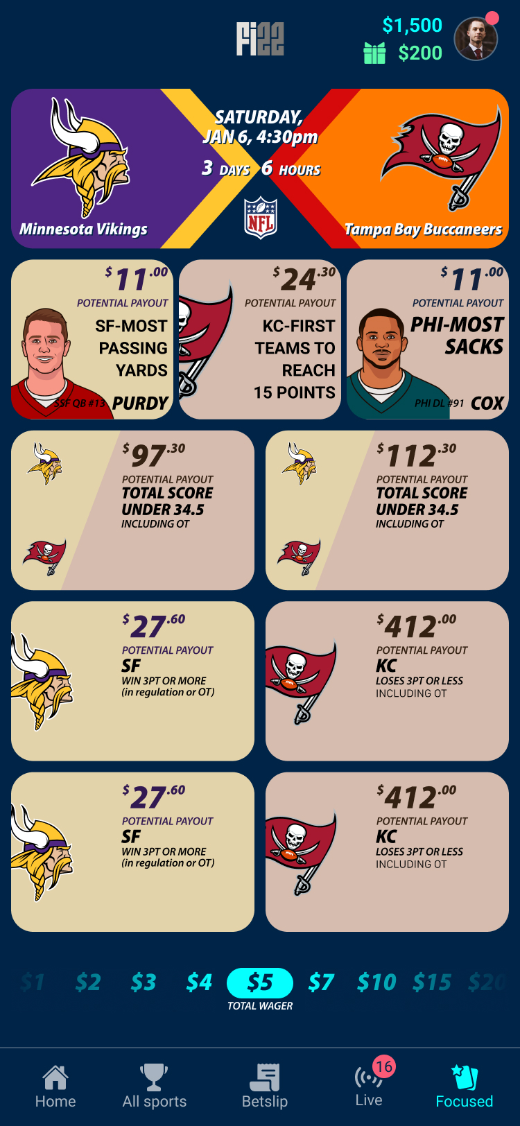
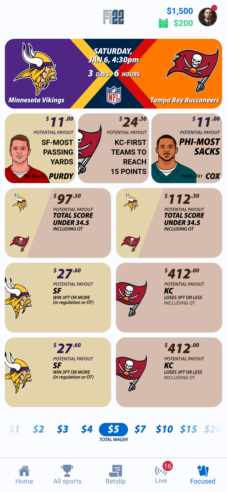
One of the most interesting side projects was Focused Mode, an app within the app designed around a completely different betting experience. For me the big question was how to design an experience that intentionally breaks the rules of the parent product while still feeling like the same product. Instead of navigating through lists of sports and markets, users could simply swipe between live events and place predefined wagers in just a few interactions. It intentionally broke many of the navigation patterns established in the main application, yet it still needed to feel like part of the same product. Designing that balance meant creating a distinct experience while preserving enough familiar interactions and visual language that users never felt they had left the SB22 ecosystem.
Another challenge came with Free to Play, a standalone mobile application created for markets where online sports betting had not yet been legalised. Instead of wagering real money, users played with virtual tokens, allowing operators to build an audience before regulation changed. Although the product served a different purpose, it shared the same foundation as the main platform. Each client required its own branding, visual identity, and token system, but because the design system had been built around reusable components and design variables, adapting the experience for new operators became a straightforward process rather than a complete redesign.

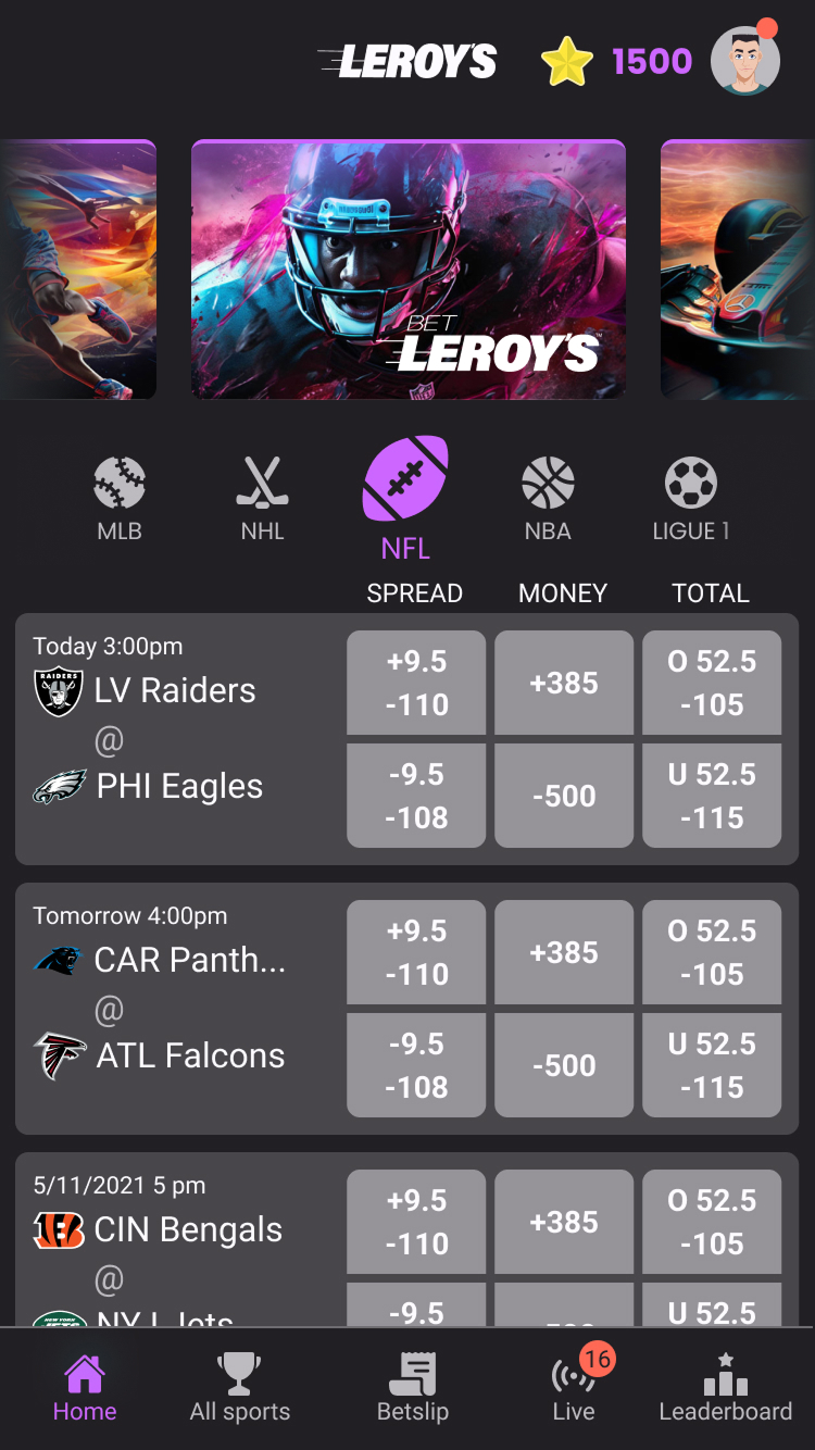
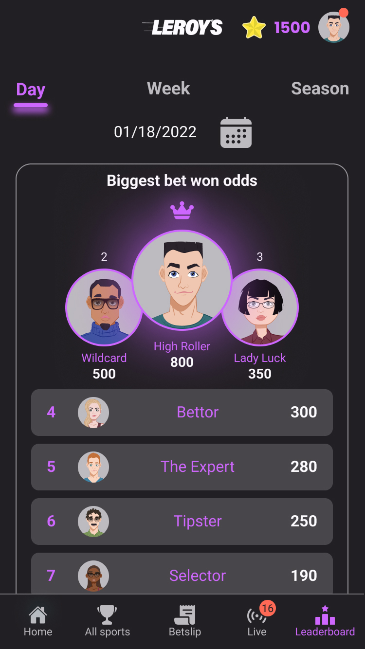
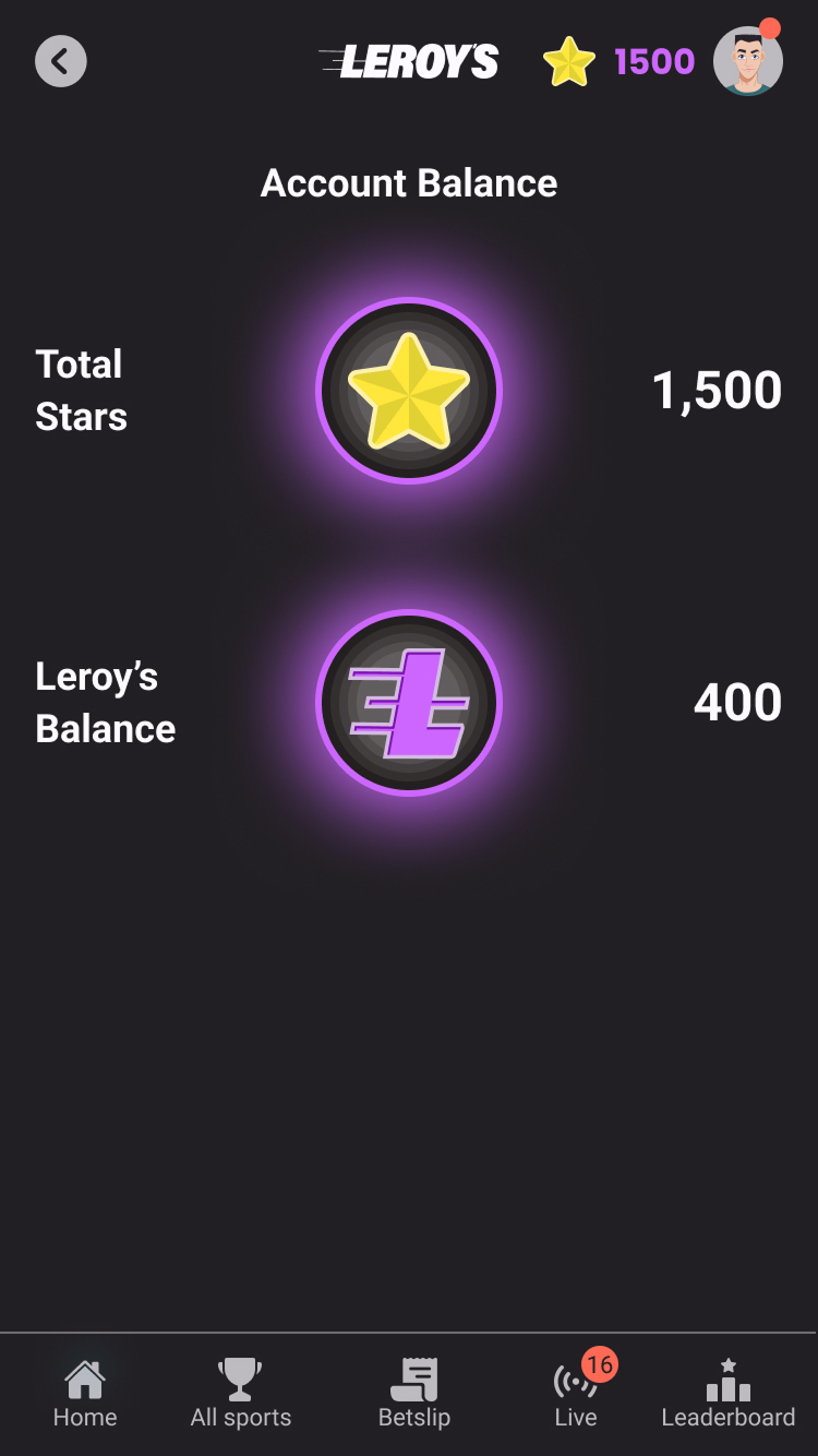

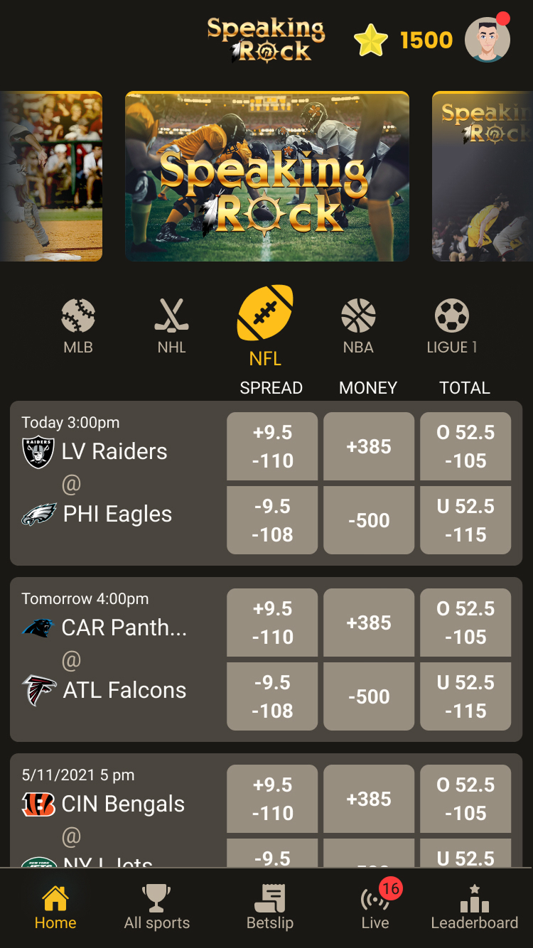
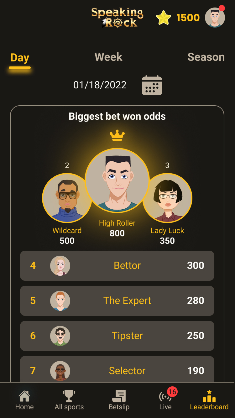
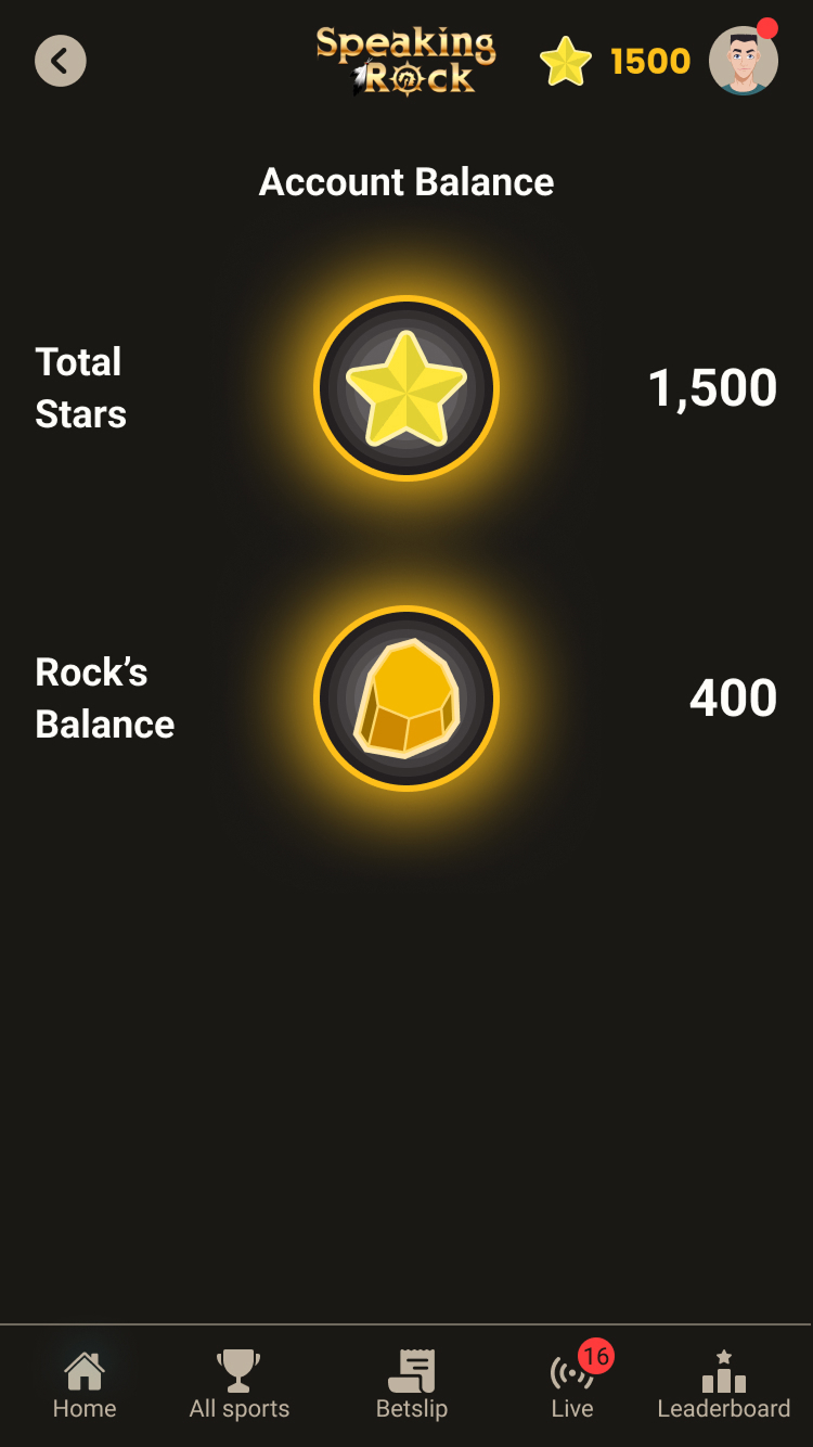
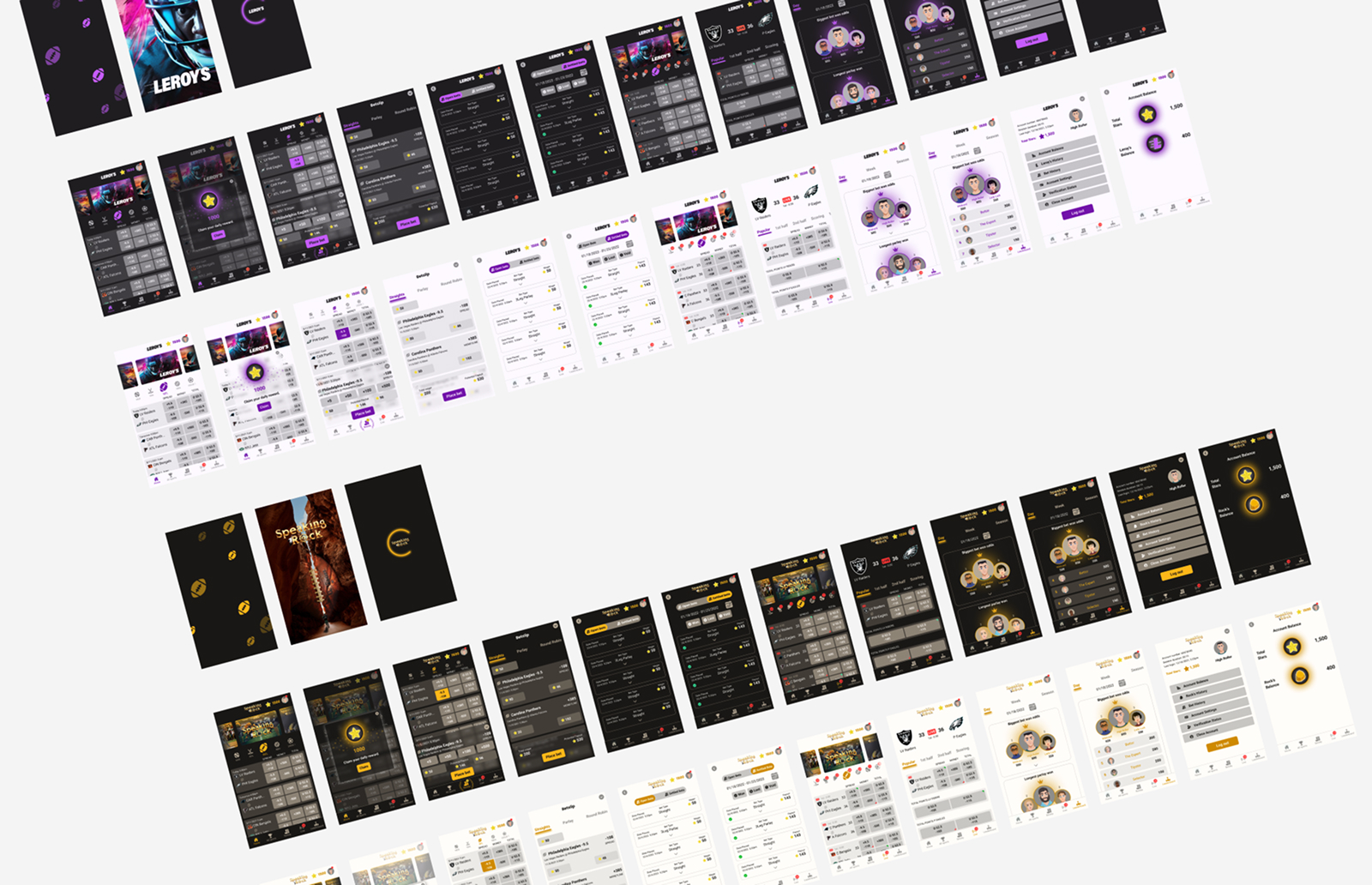
Working in a startup also meant that priorities changed almost daily. New ideas, technical constraints, and business opportunities constantly reshaped the roadmap, so flexibility became just as important as consistency. Instead of treating change as an obstacle, I learned to build interfaces and components that could adapt quickly while preserving a coherent user experience. That mindset proved invaluable as the platform expanded into new products and devices over time.
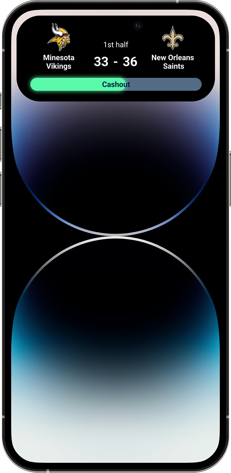
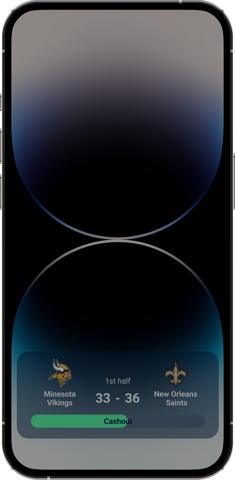
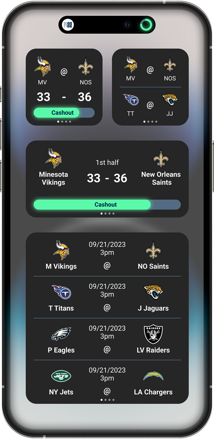
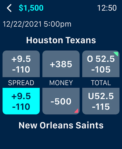
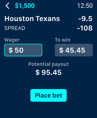
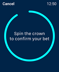
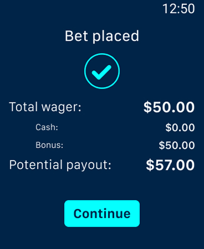
At one point, the business decided to bring the platform to Apple Watch. It was an ambitious challenge: distilling a feature-rich product into its essential experience on the smallest screen. The limited display forced me to rethink the interface from first principles rather than simply scaling down the mobile app. The challenge was finding the right balance between information density and readability, deciding what deserved immediate visibility and what could be omitted altogether. The hardest part wasn't fitting everything onto a smaller screen, it was deciding what not to show. Designing within those constraints reinforced the importance of hierarchy, prioritisation, and creating an experience that felt native to the device while remaining unmistakably part of the same product ecosystem.
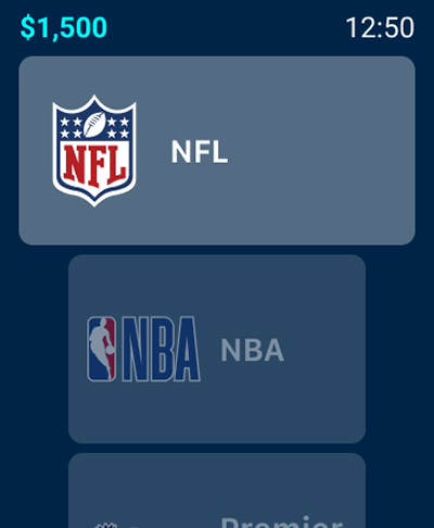
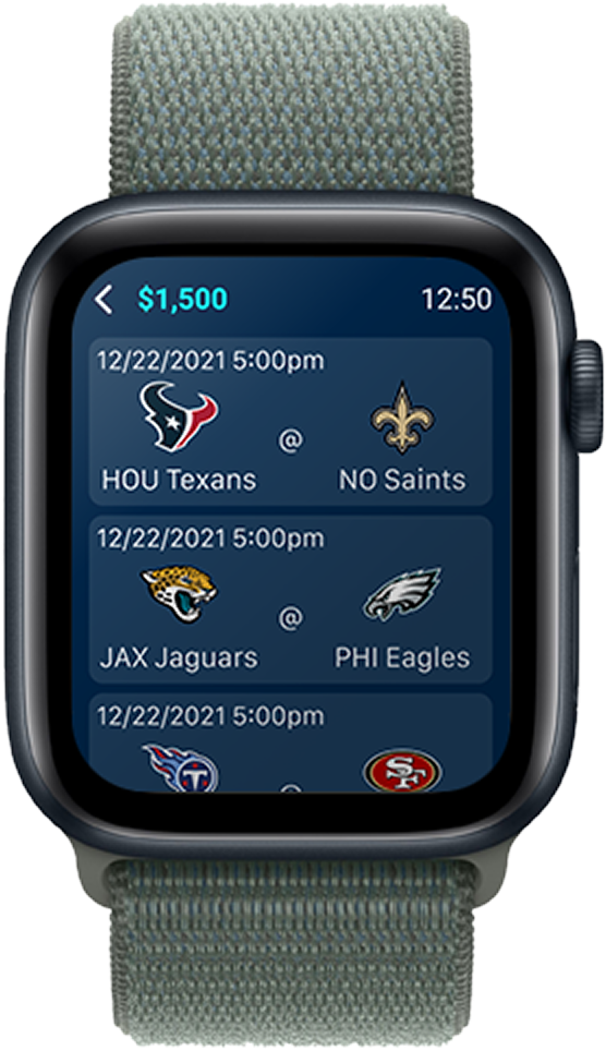
Looking back, SB22 fundamentally changed the way I think about product design. It taught me that successful products aren't built screen by screen, they're built as systems. Designing for rapid growth, close collaboration with engineers, and an evolving product vision gave me a much deeper understanding of scalability, product architecture, and the relationship between design and implementation. Those lessons continue to shape how I approach every project today.
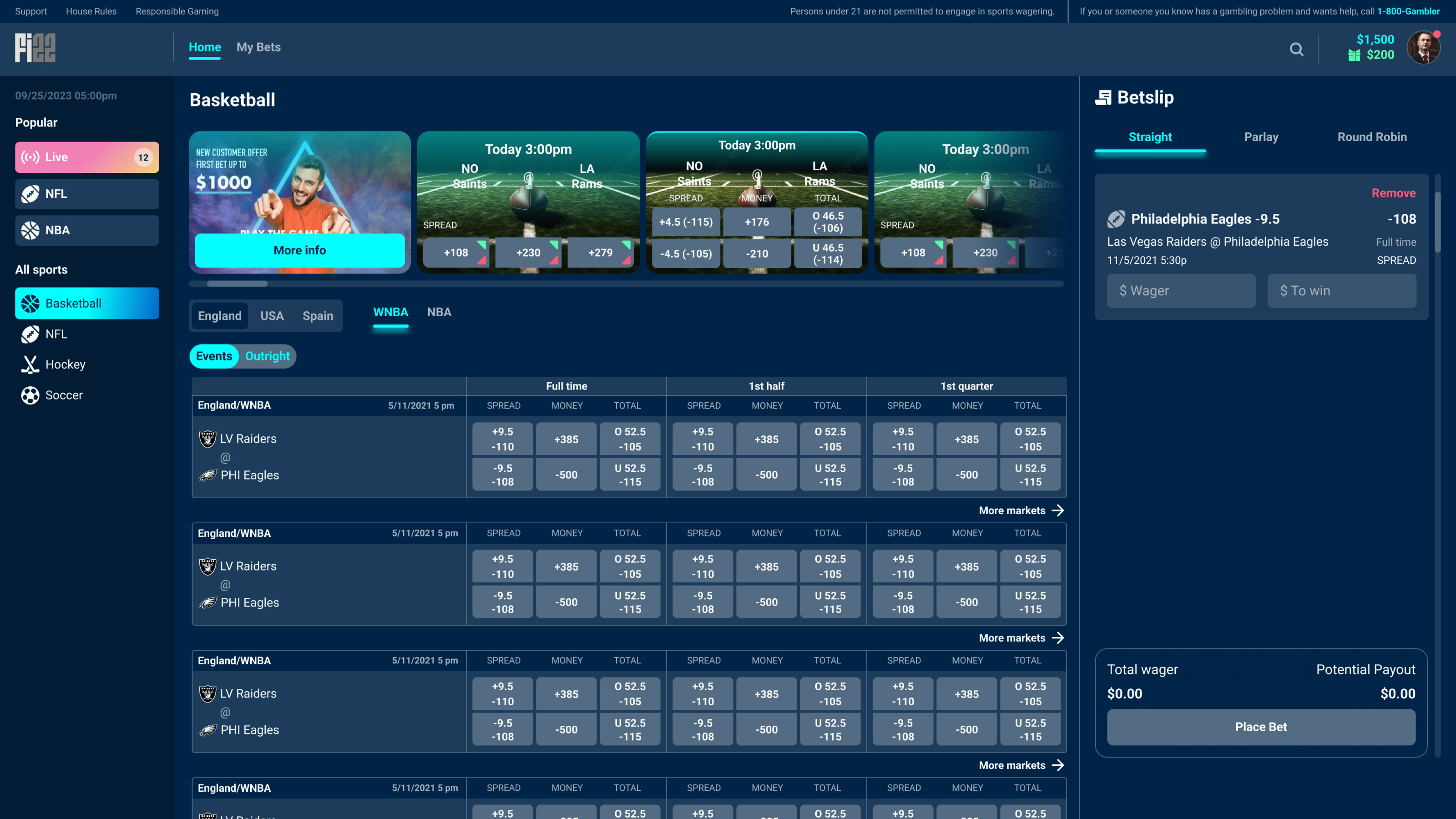
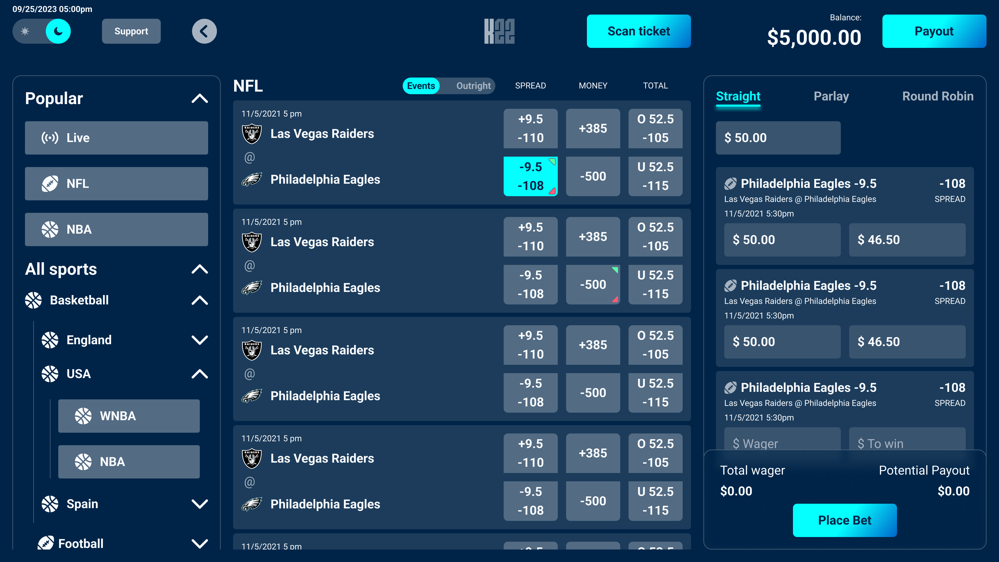
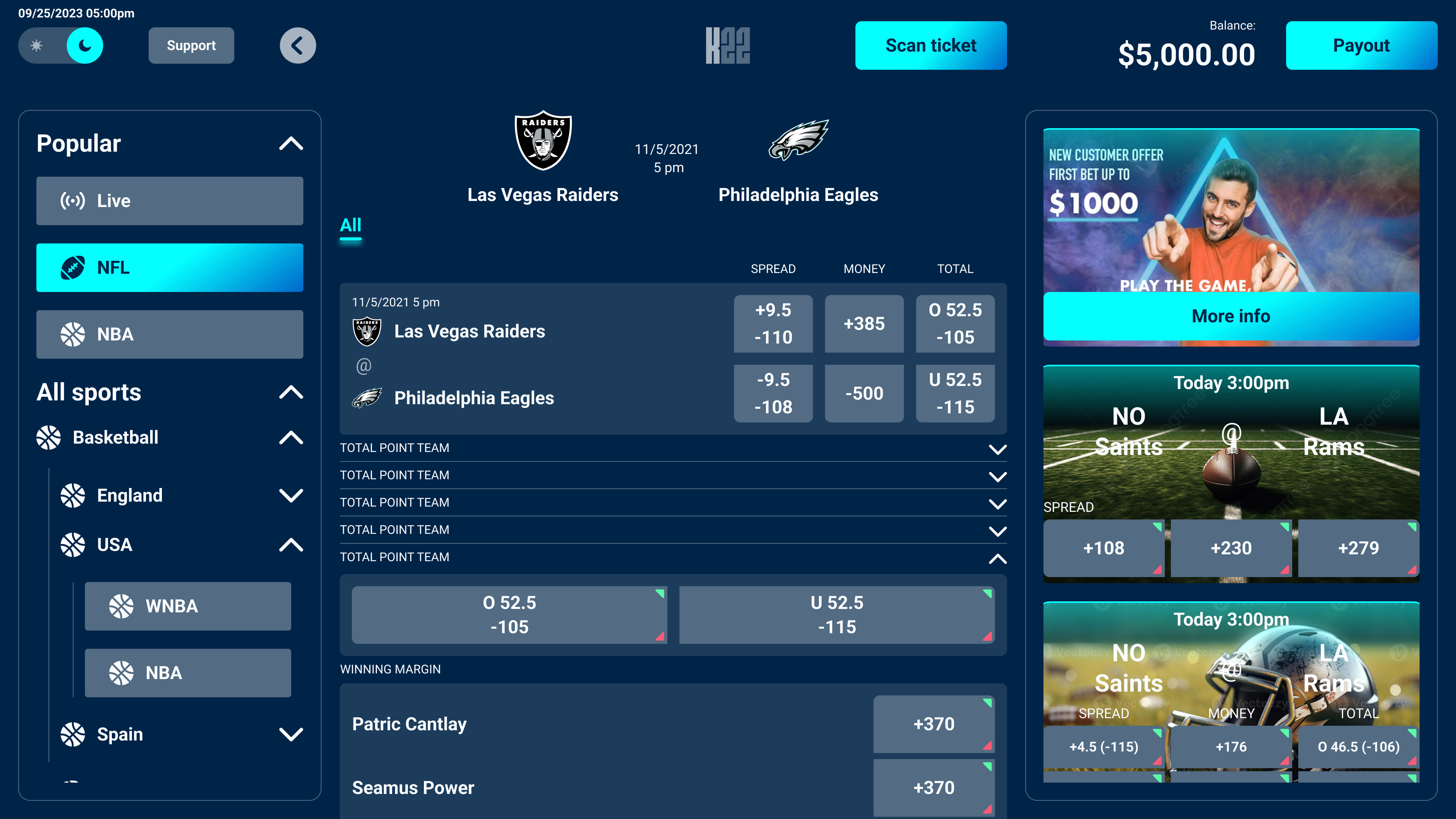
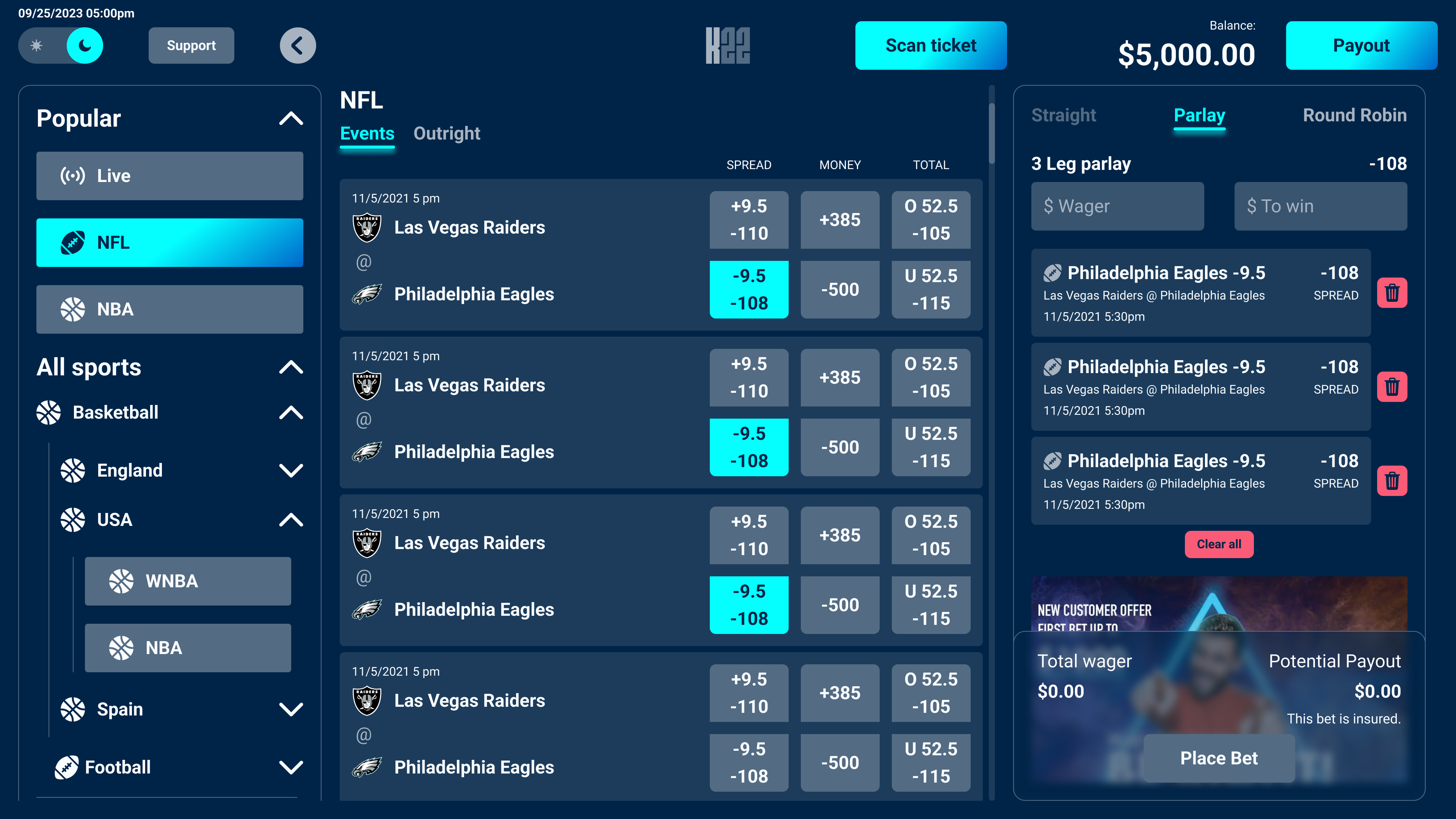
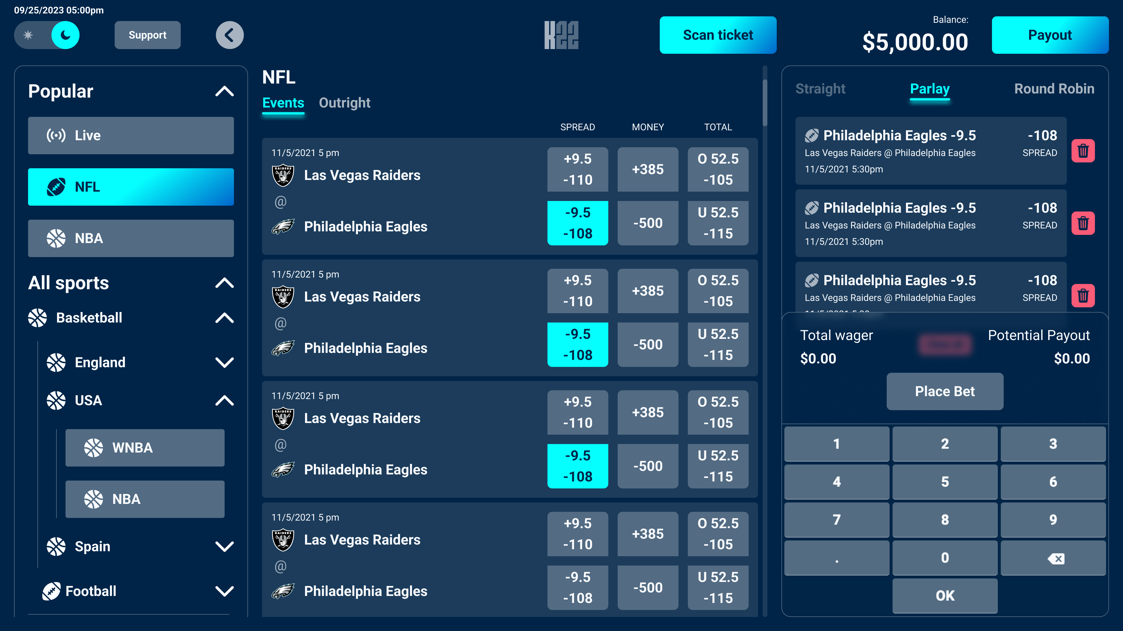
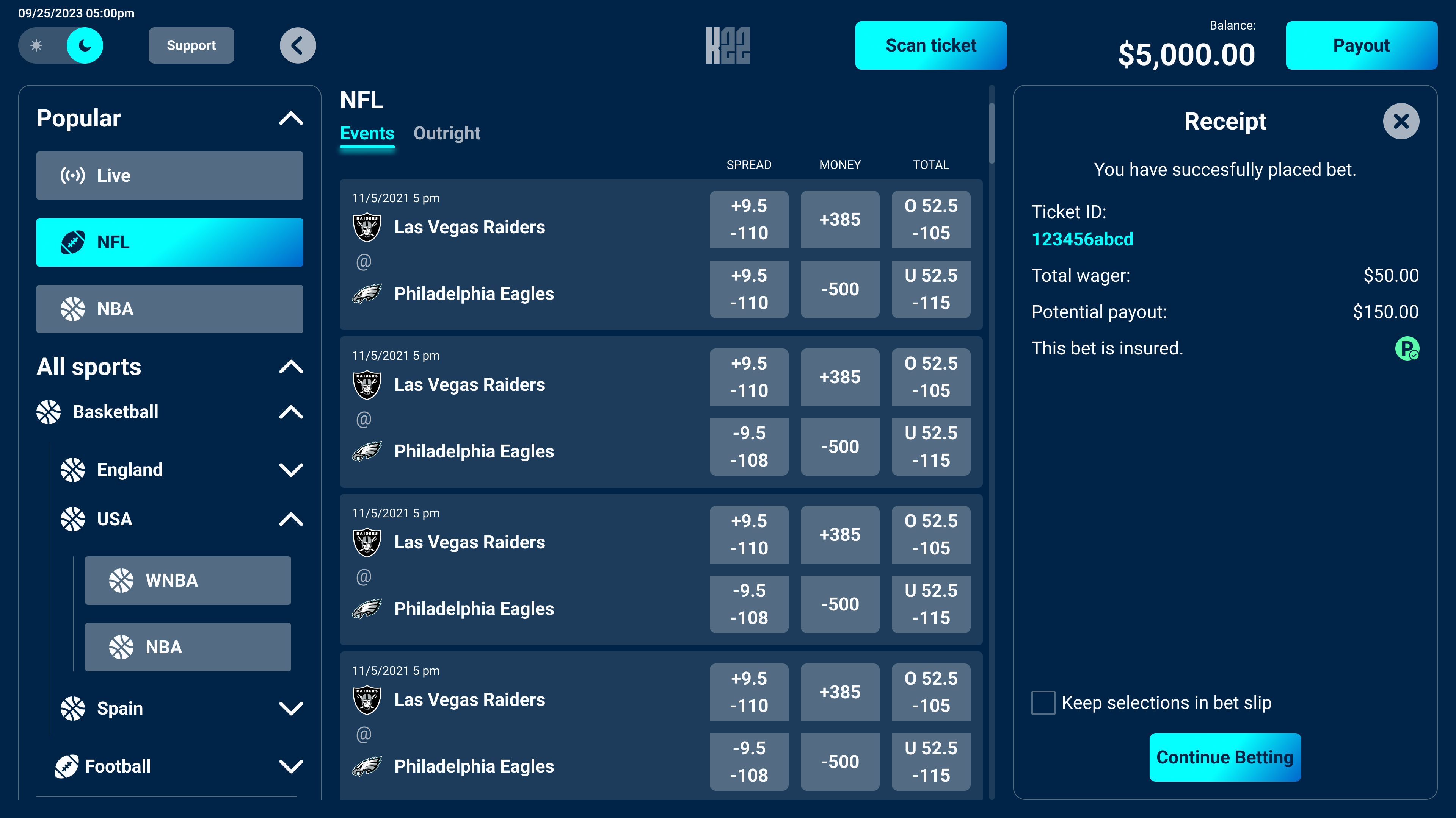
Another chapter in the platform's evolution was designing the self-service betting kiosk. While it shared many features with the desktop application, the context of use was completely different. The kiosk had no user accounts or authentication, as it was designed for quick, anonymous interactions in physical locations. At the same time, it required a dedicated service mode that allowed operators to maintain, configure, and troubleshoot the machine without affecting the customer experience.
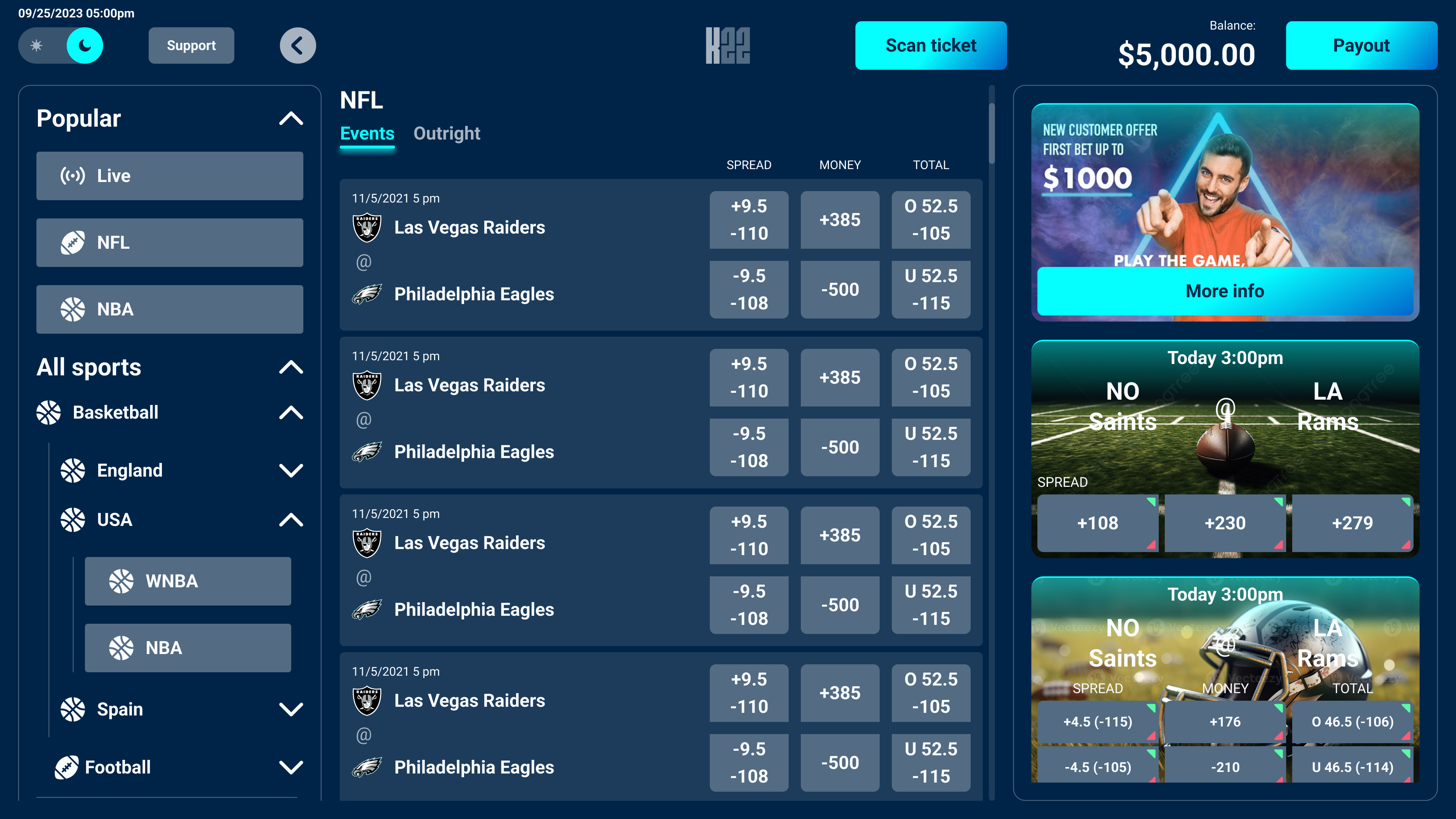
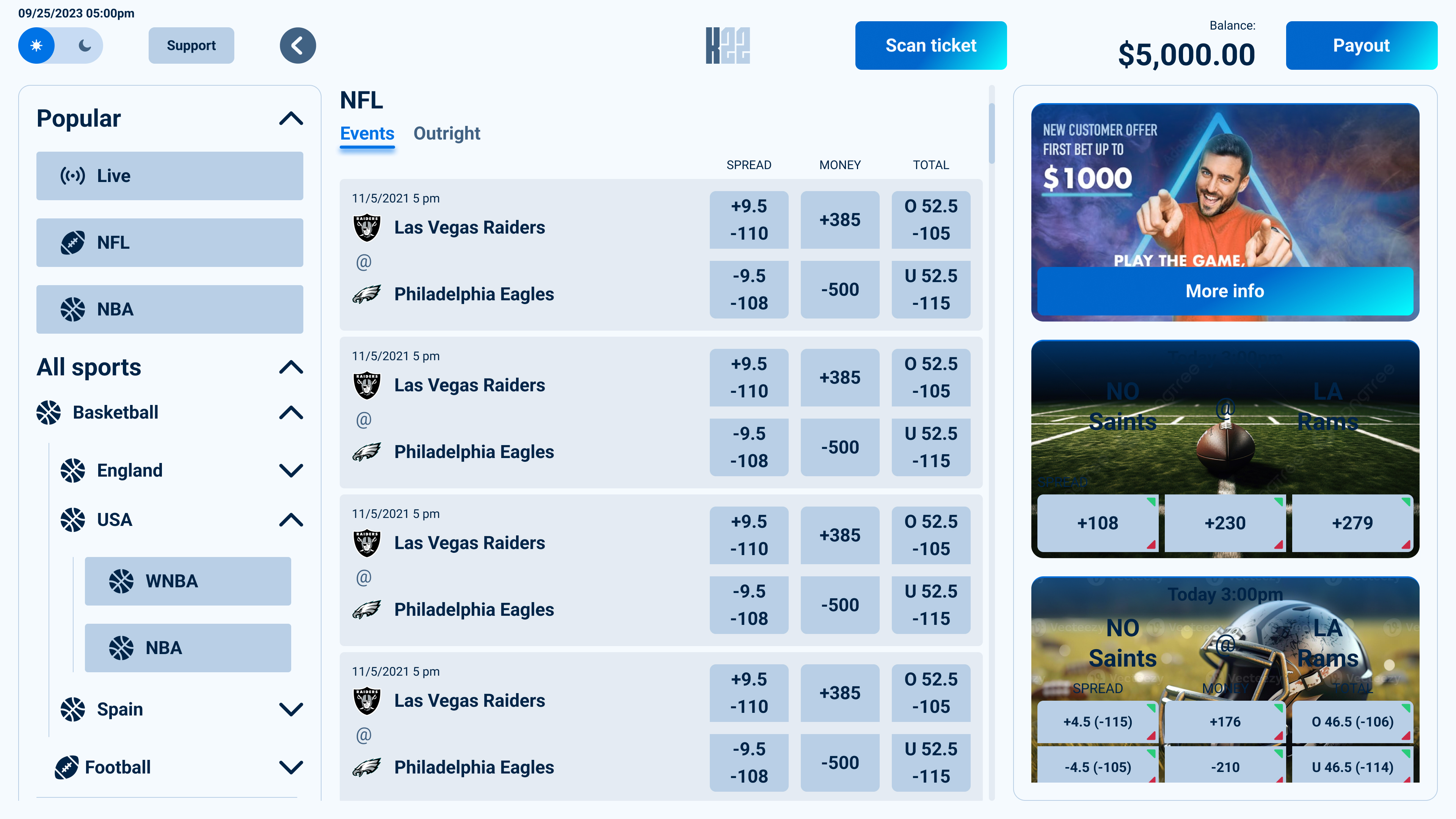
I needed to adapt the platform to a touch-first environment where users interact directly with the screen, often standing, sometimes in busy betting shops, and expecting immediate feedback. Every interaction had to feel larger, faster, and more forgiving than on desktop, from touch targets and navigation to the overall flow of placing a bet.
Working alongside the dedicated kiosk team also gave me valuable insight into the hardware behind the product. Understanding the physical constraints of the machine, from screen dimensions and printers to scanners and maintenance workflows, helped me design interfaces that weren't just visually consistent but also practical within the realities of a self-service device. It reinforced how closely software and hardware influence one another when designing products that exist beyond the screen.
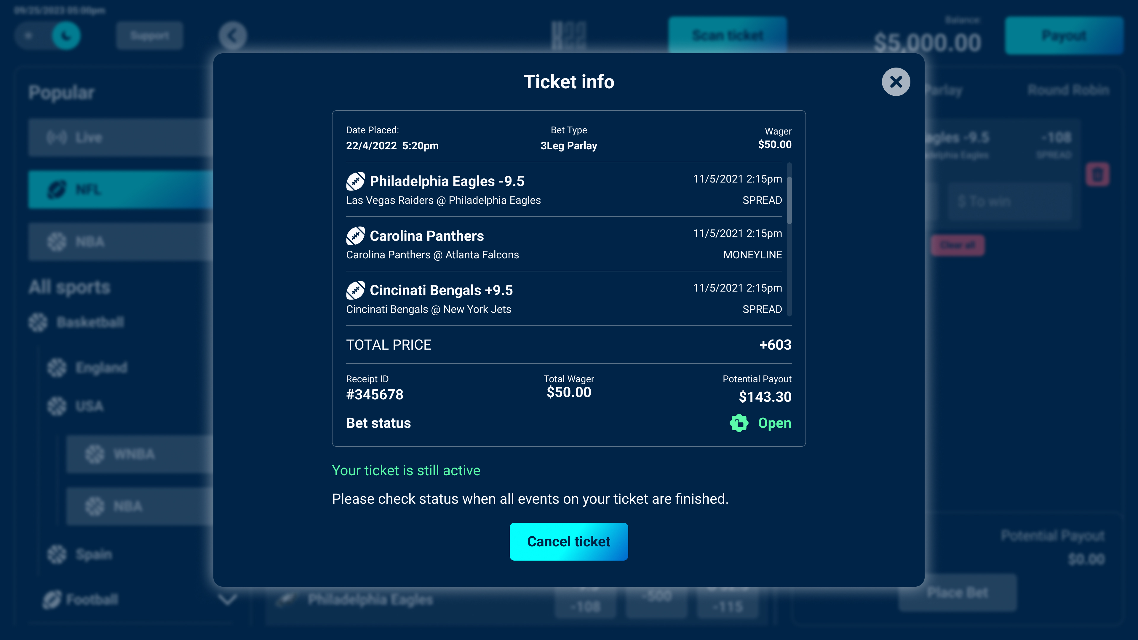
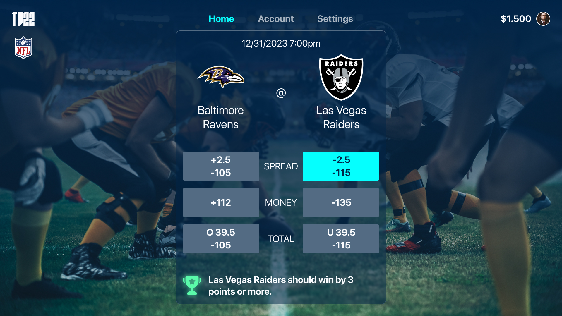
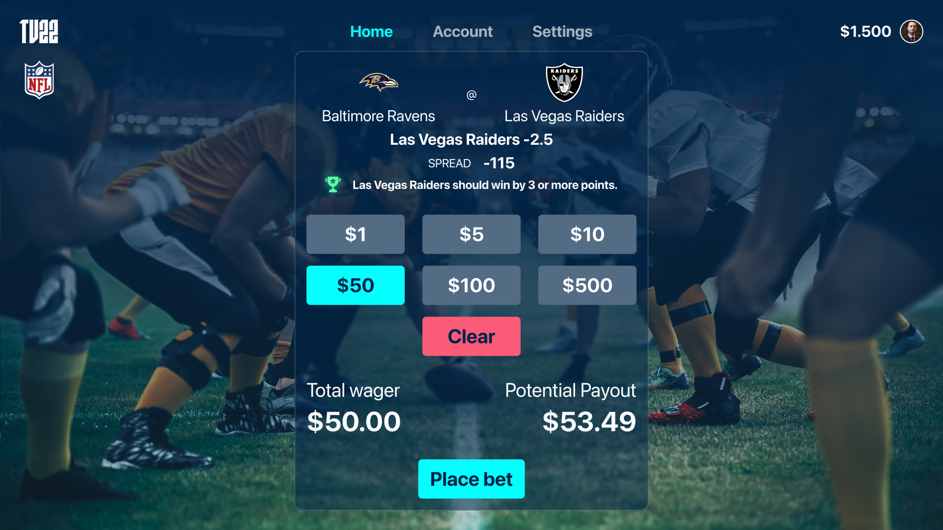
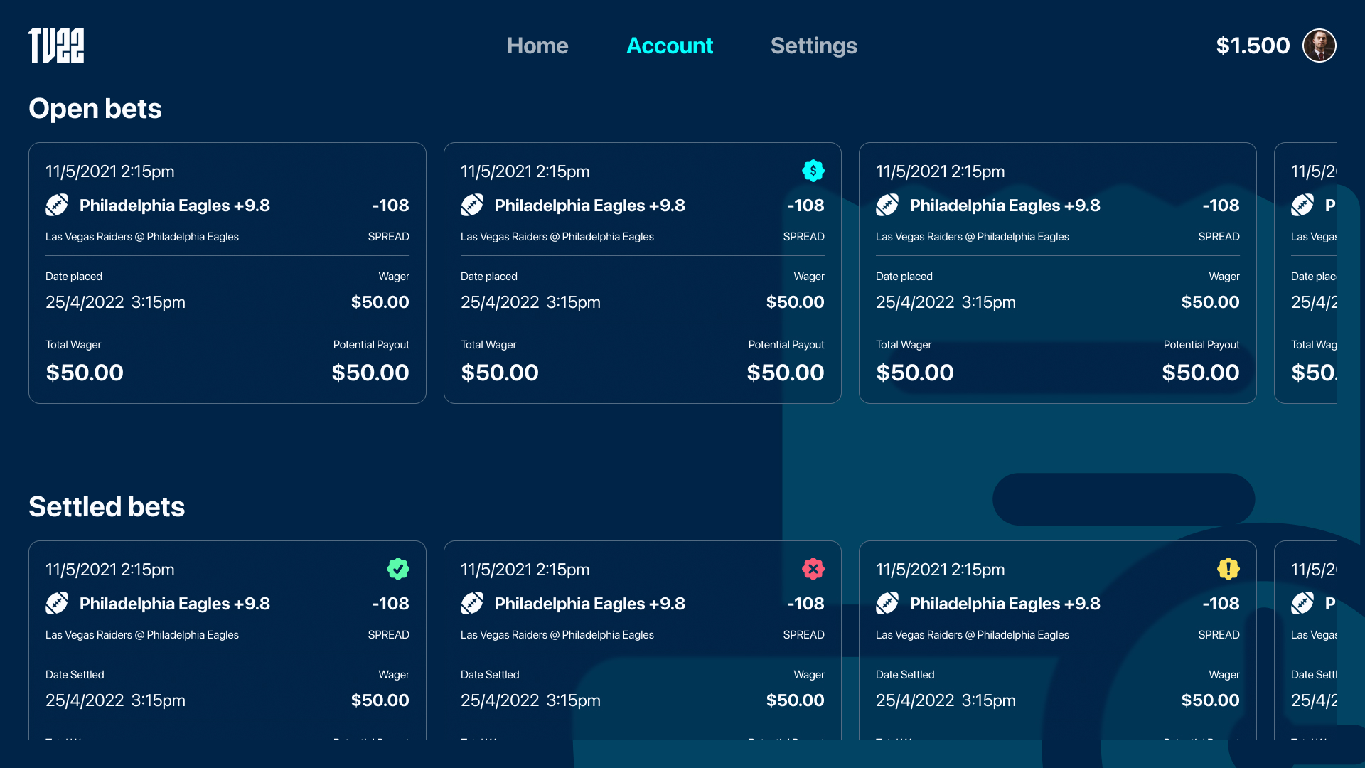
Every new platform forced me to rethink the same product through a completely different interaction model, and Apple TV was no exception. Instead of designing for a device held in the user's hand, I was designing for a large screen viewed from across the room, where every interaction is driven by the Siri Remote and a focus-based navigation system.
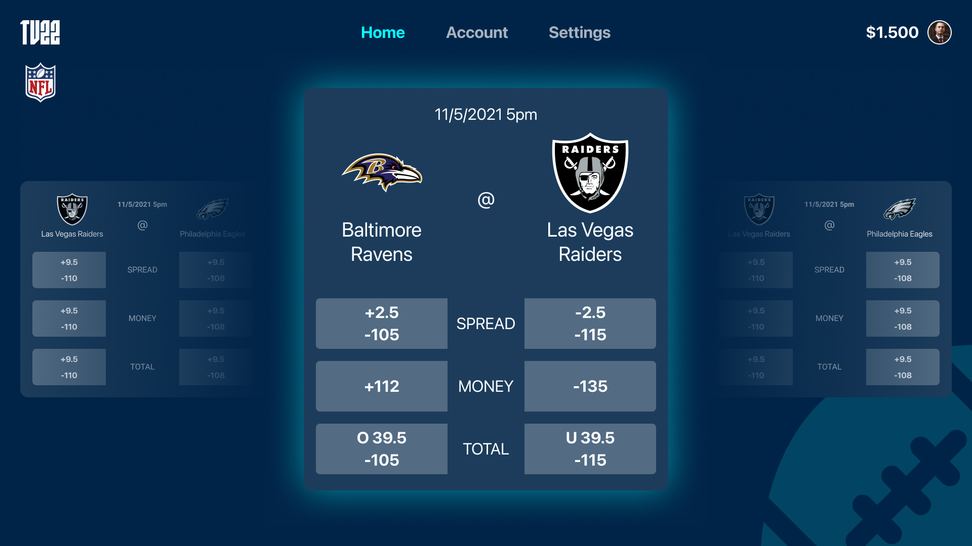
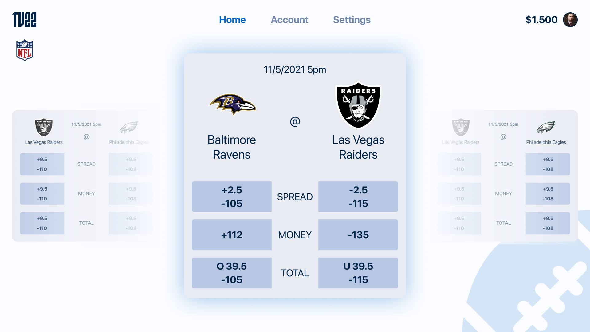
Designing for television meant using the additional screen space with intention. The goal wasn't to fit more content onto the screen, but to improve clarity and readability from a distance. Larger typography, generous spacing, and carefully structured layouts improved readability from a distance, while clear focus states and predictable navigation made moving through the interface feel effortless. Every interaction had to communicate where the user was, where they could go next, and how they would get there using only the remote.

The Backoffice presented a completely different kind of challenge. While the customer-facing products focused on creating the best possible betting experience, the Backoffice had to support the people running the entire platform behind the scenes. Traders, customer support agents, administrators, operators, and other internal teams all relied on the same product, each with their own workflows, responsibilities, and priorities.
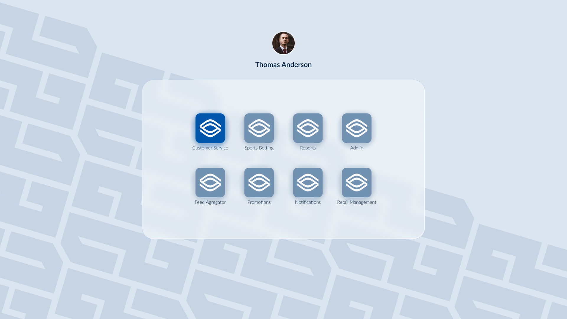
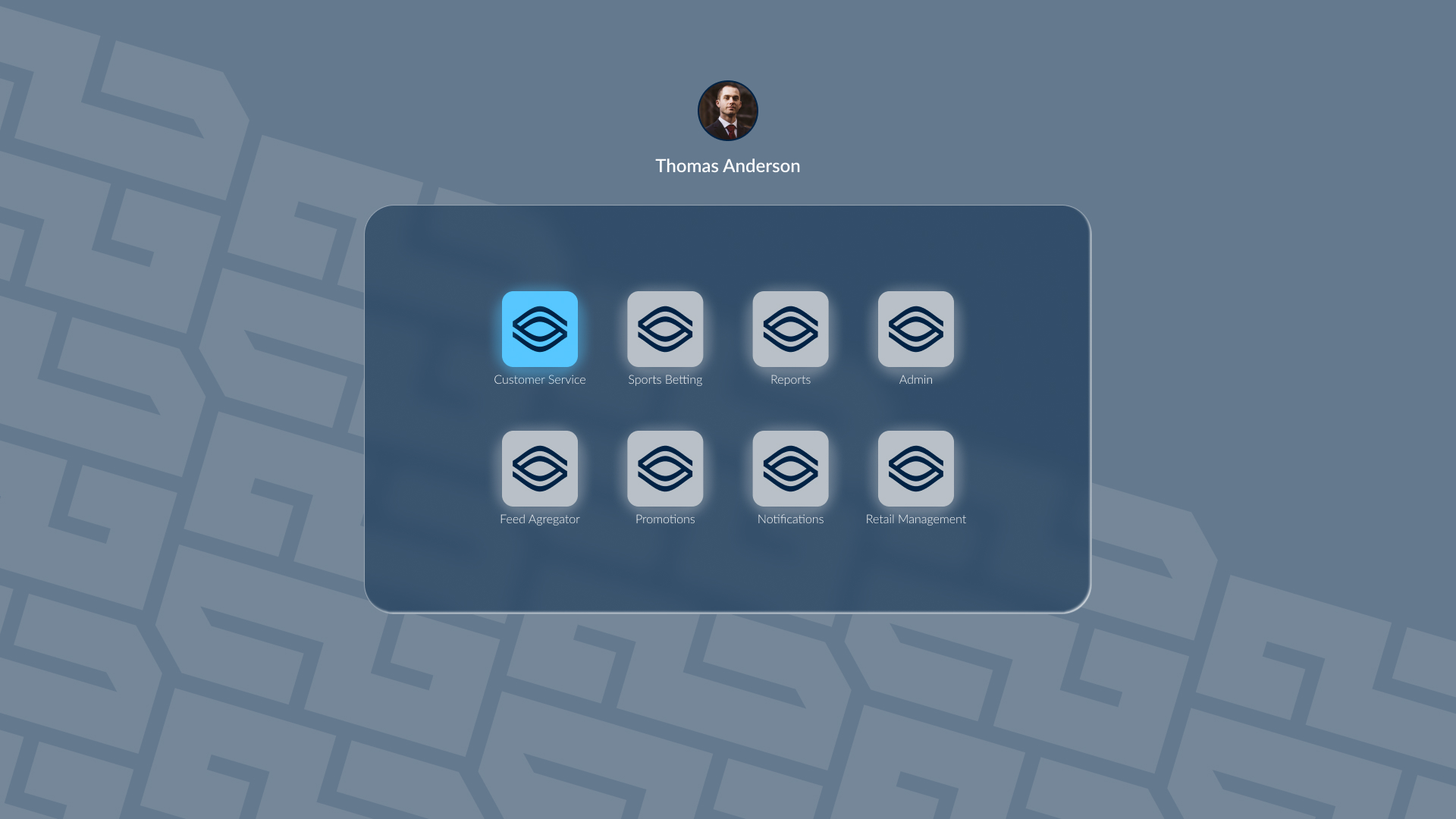
Traditionally, many sports betting platforms separate these roles into multiple back-office applications. Our goal was different, we wanted to bring everything together into a single, modular product. That introduced a new layer of complexity. Users could have one role, several roles, or highly customised permission sets, meaning the interface itself had to adapt dynamically based on what each person was allowed to see and do.
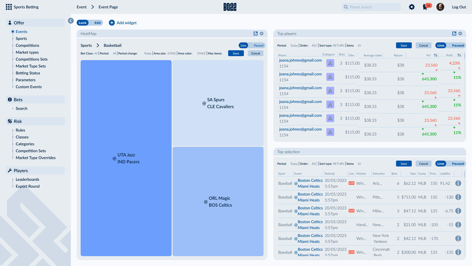
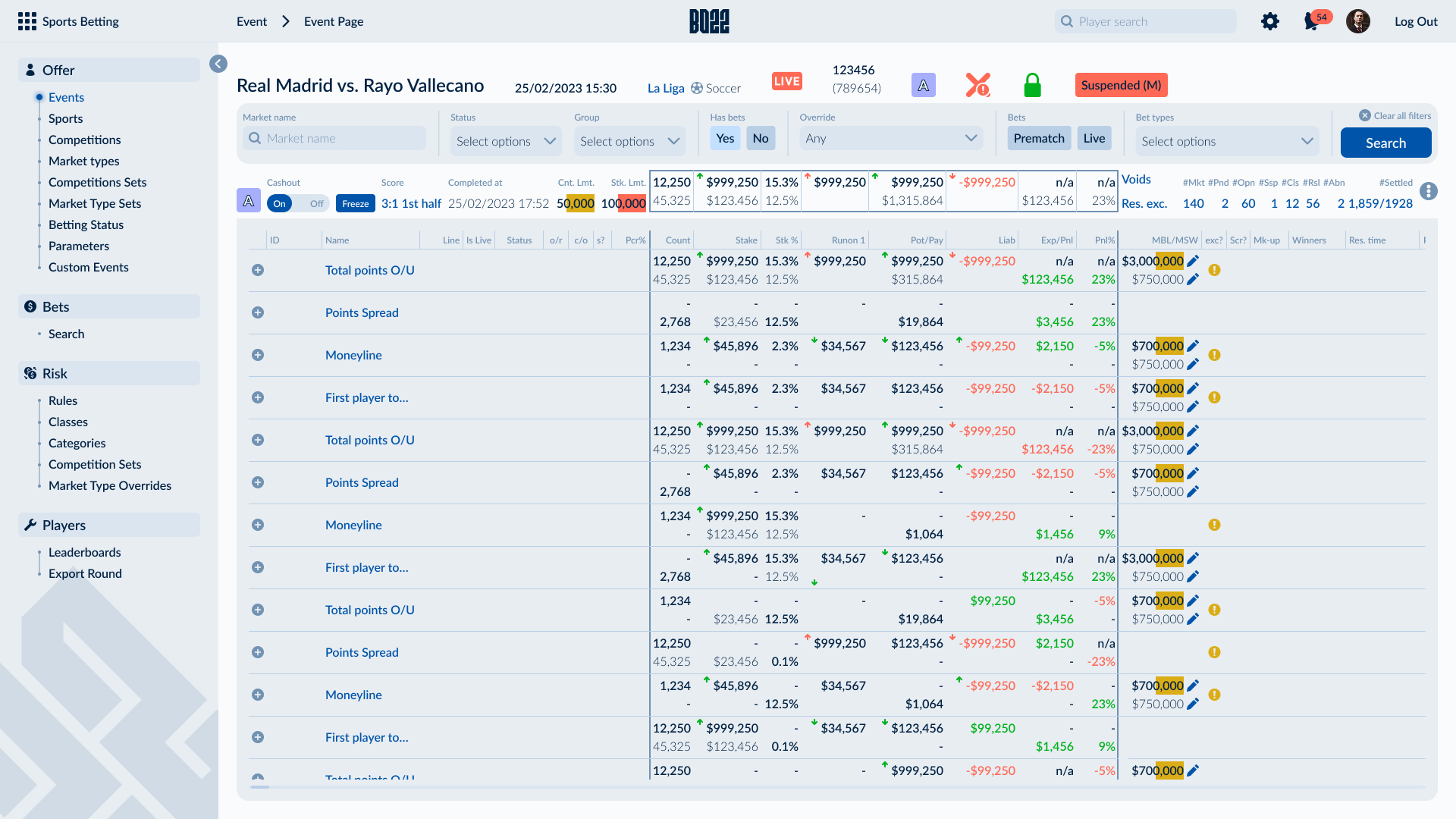
Designing a universal interface for such diverse users required a flexible approach. Instead of creating fixed page layouts for every module, I designed a widget-based system where each module could be assembled from reusable, configurable building blocks. The widgets accommodated everything from simple form controls and filters to complex data tables, dashboards, and real-time monitoring tools, allowing the interface to scale without losing consistency.
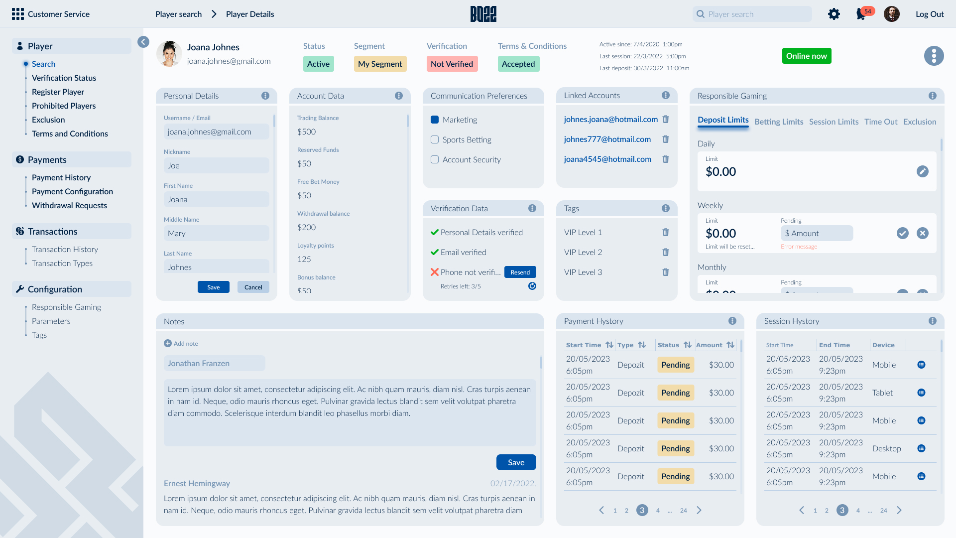
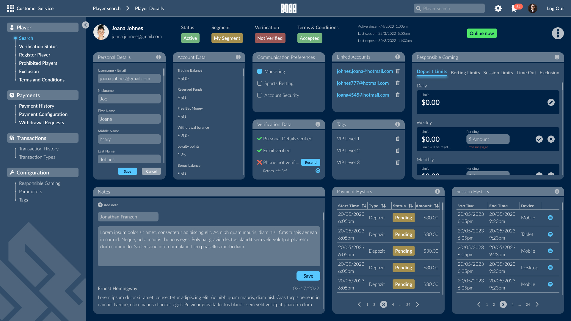
Another challenge was designing for very different working environments. Traders often operate with multiple 4K displays filled with live data, while customer support teams and administrators typically work from standard monitors or laptops. Every module needed to remain responsive and efficient across this wide range of screen sizes, ensuring that information density, readability, and usability were preserved regardless of the hardware.
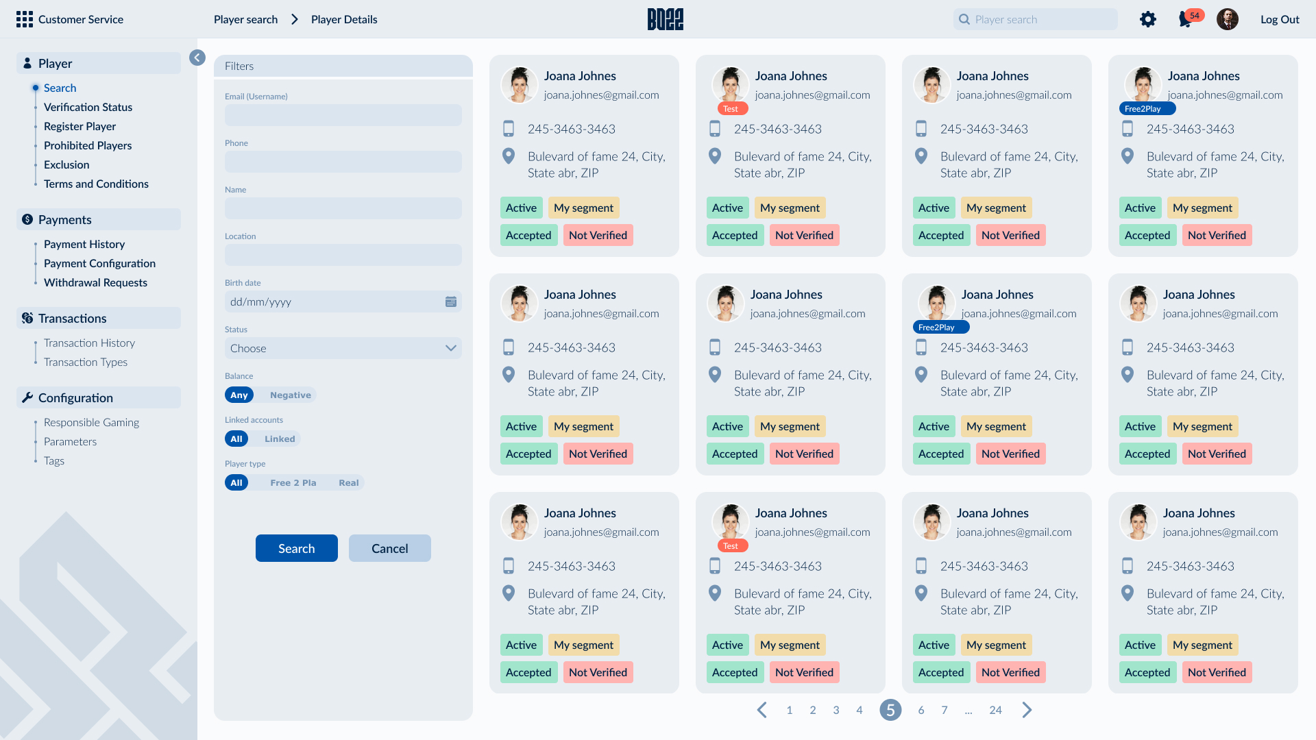
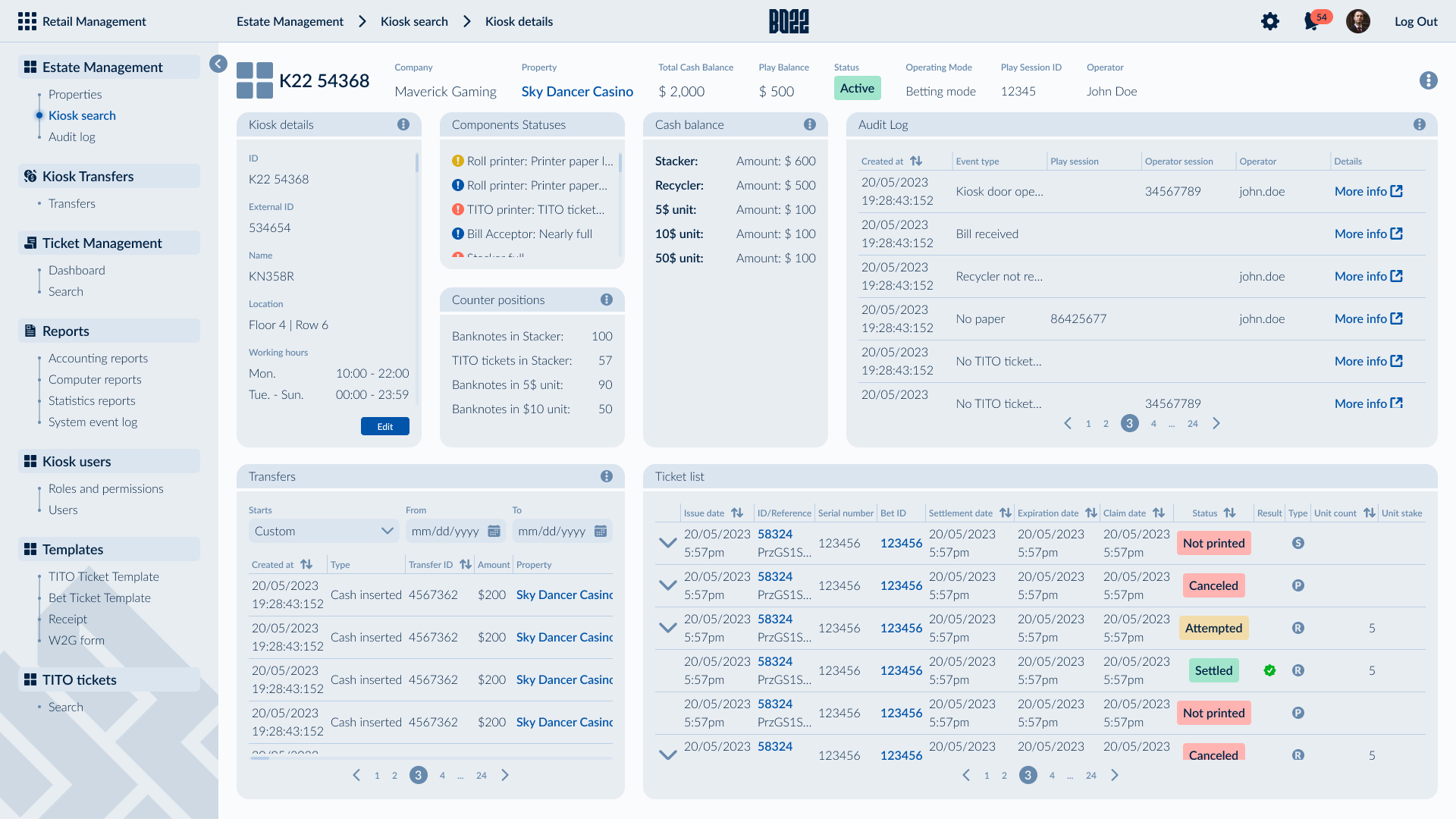
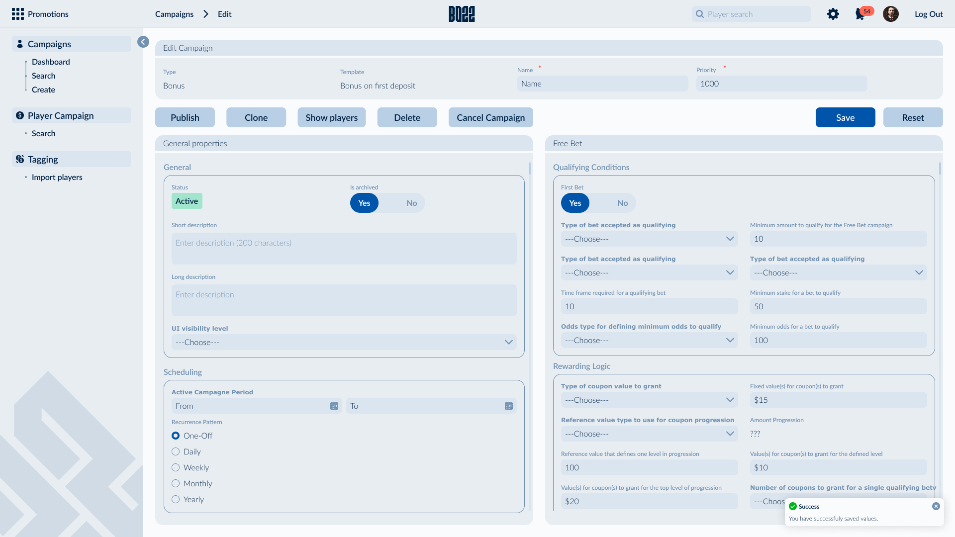
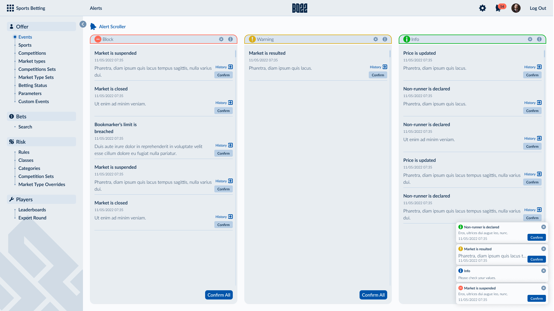
Working closely with the dedicated Backoffice team, we built a scalable design system that could grow alongside the platform. New modules could be introduced without redefining the user experience, while reusable components, responsive layouts, and permission-aware interfaces kept the product cohesive despite its growing complexity. It was one of the projects that most strengthened my understanding of designing large-scale enterprise software, where flexibility, consistency, and long-term scalability are just as important as the interface itself.